Listen Better
A series of typographic explorations of the phrase Listen Better for Sonos. The custom letterforms blur the line of legibility and communicate a message beyond the written word.
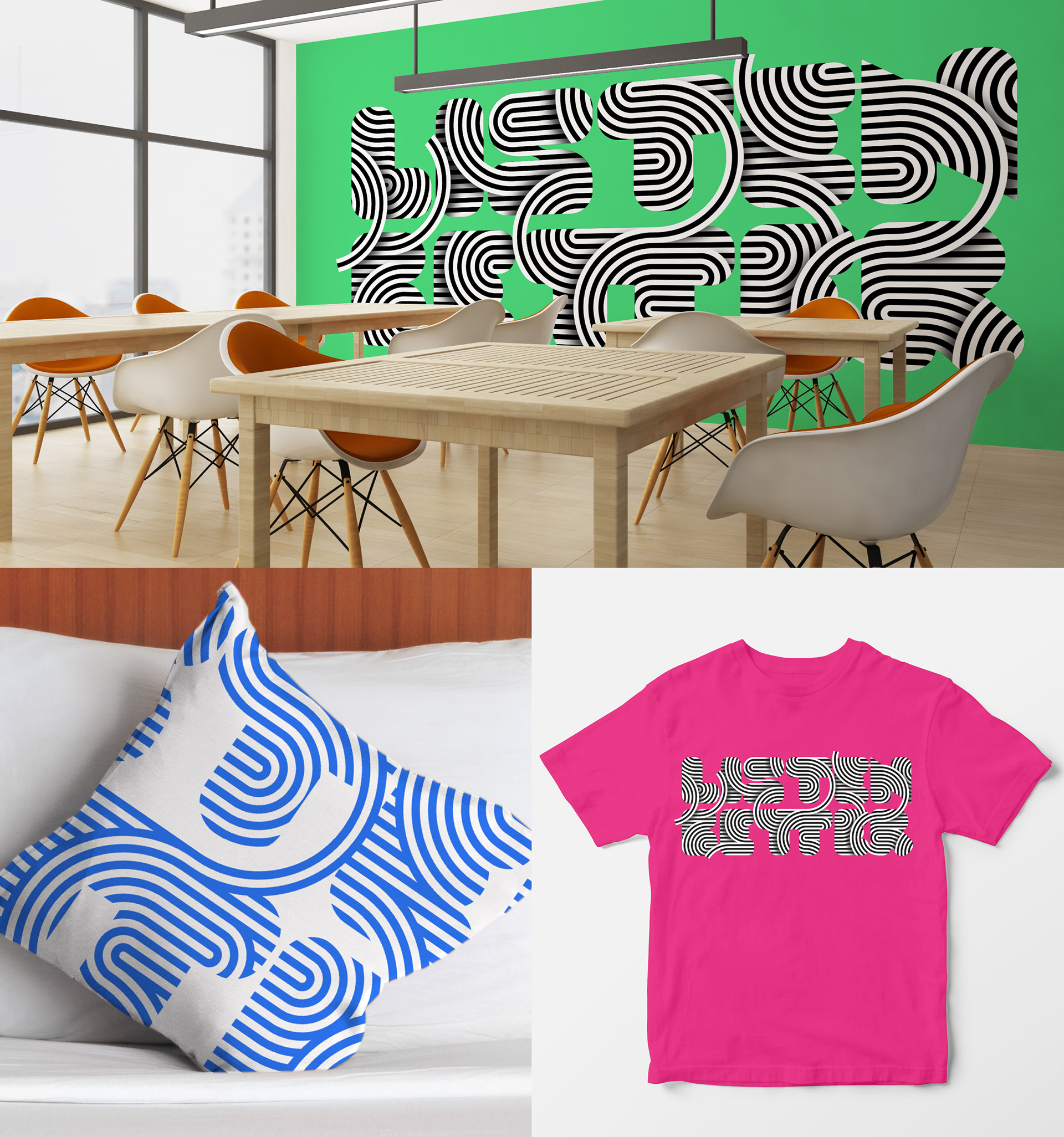
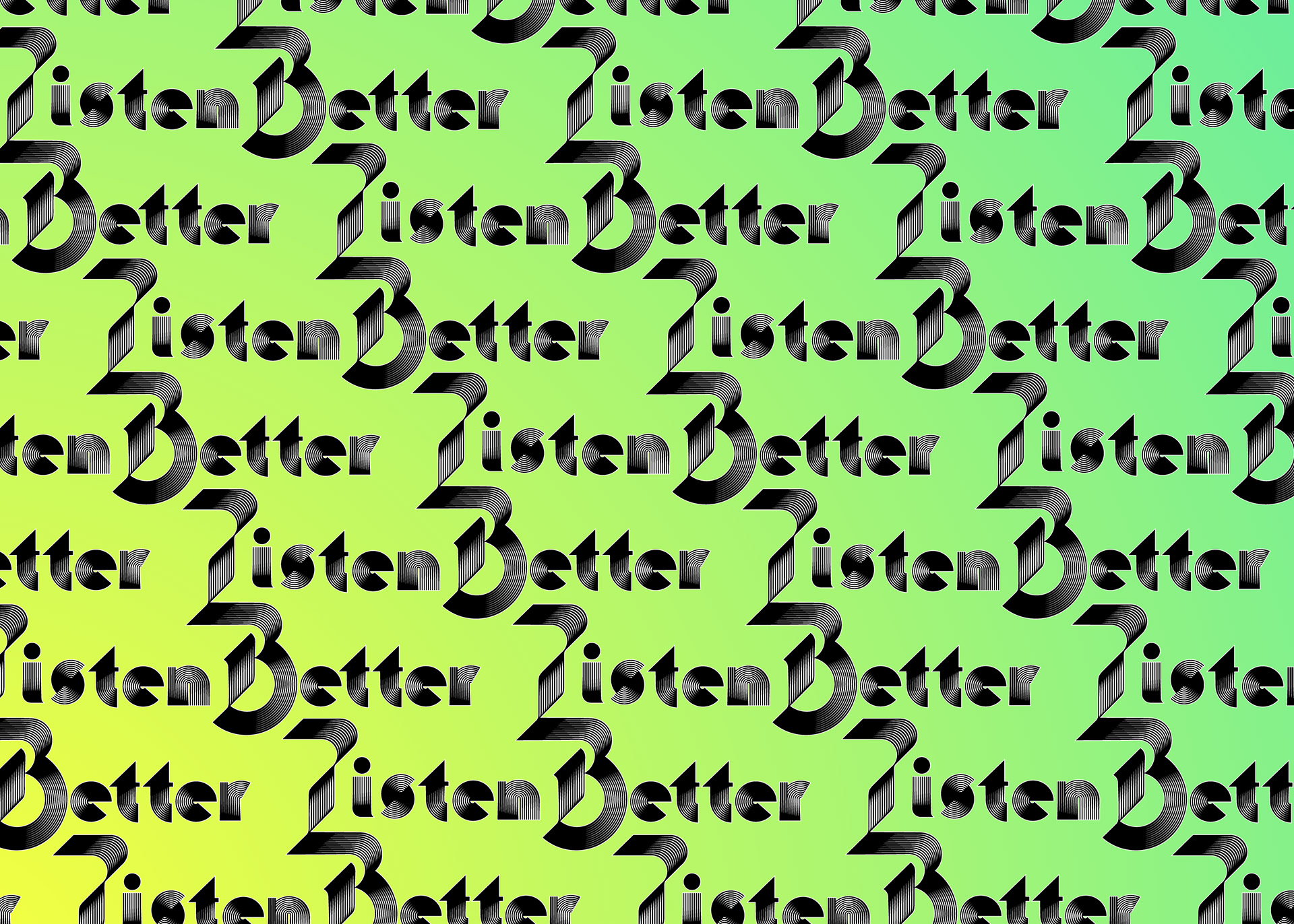
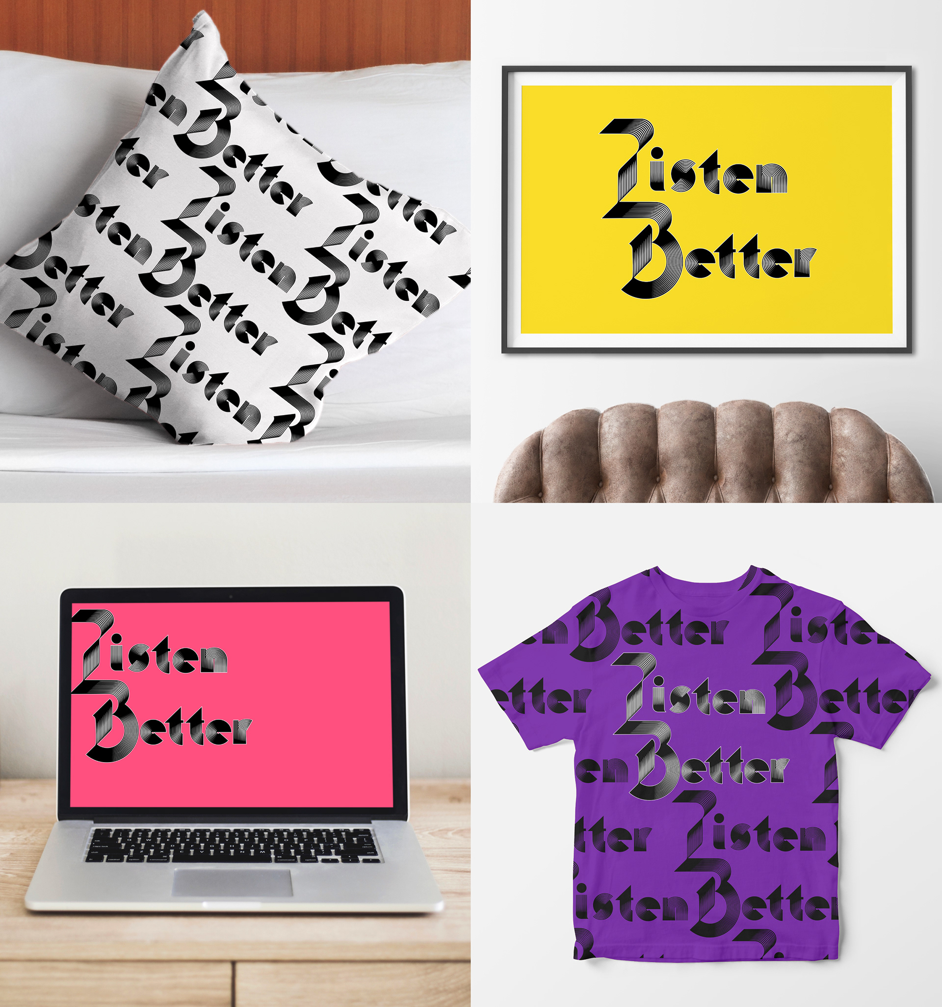
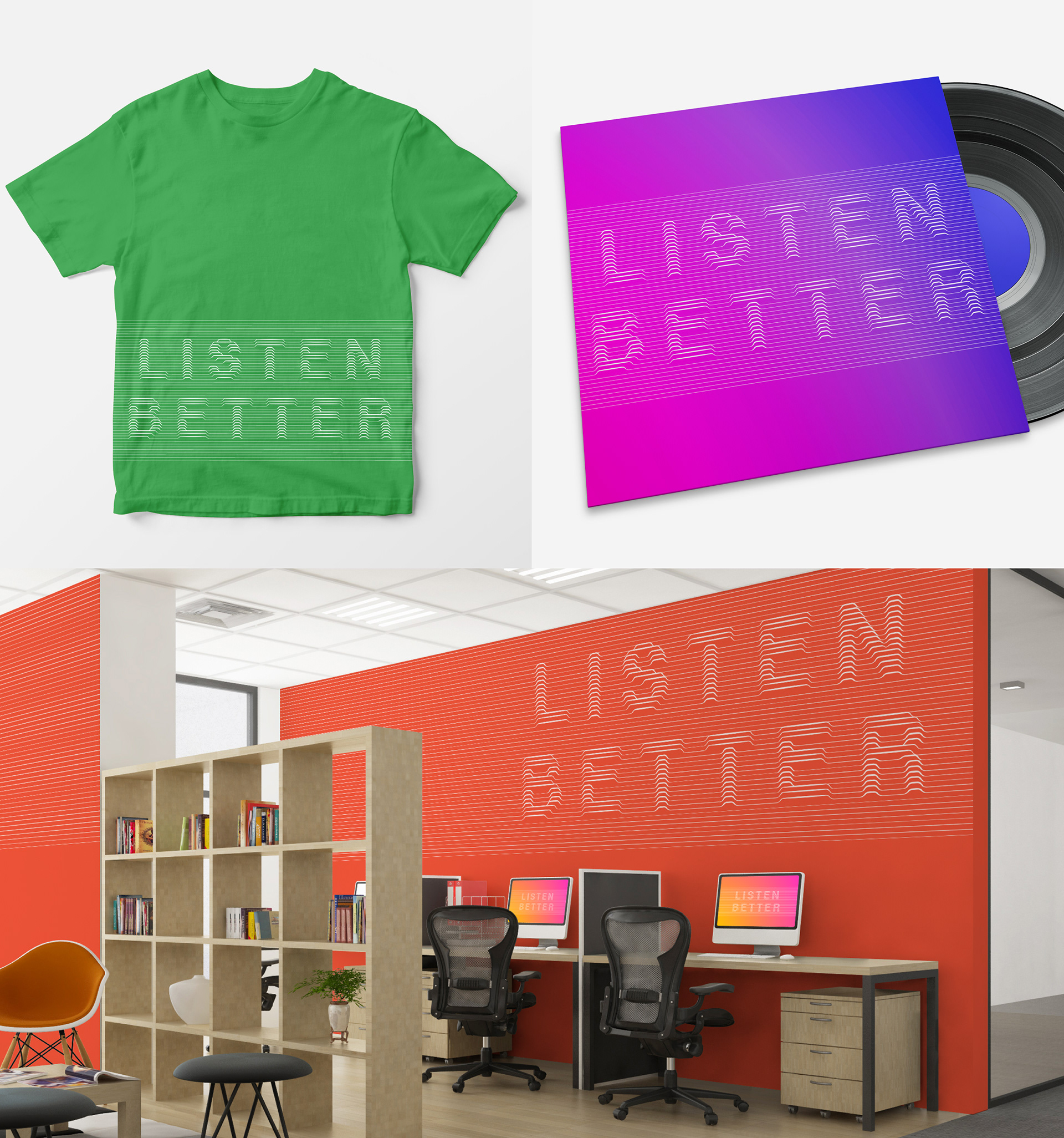
These explorations are shown in mockups to show potential context on products, environments, and in various colors.
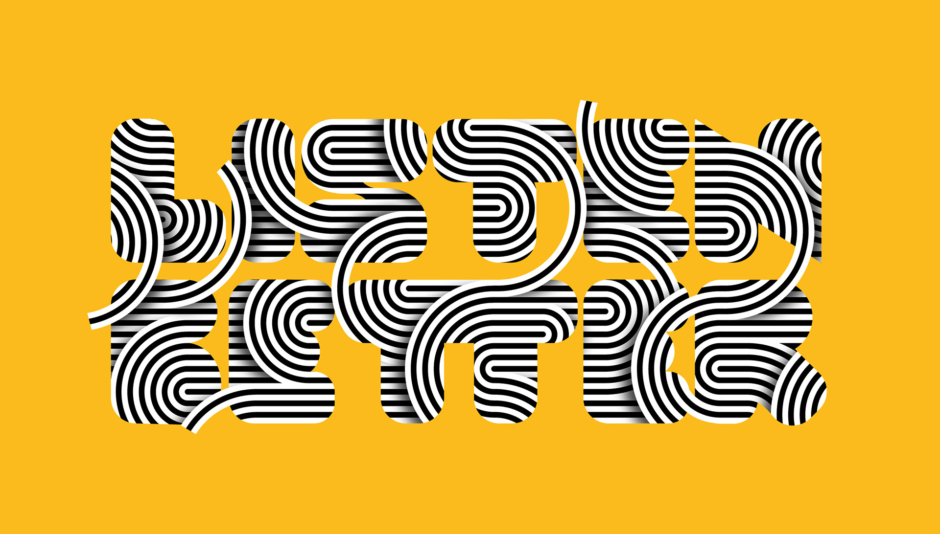
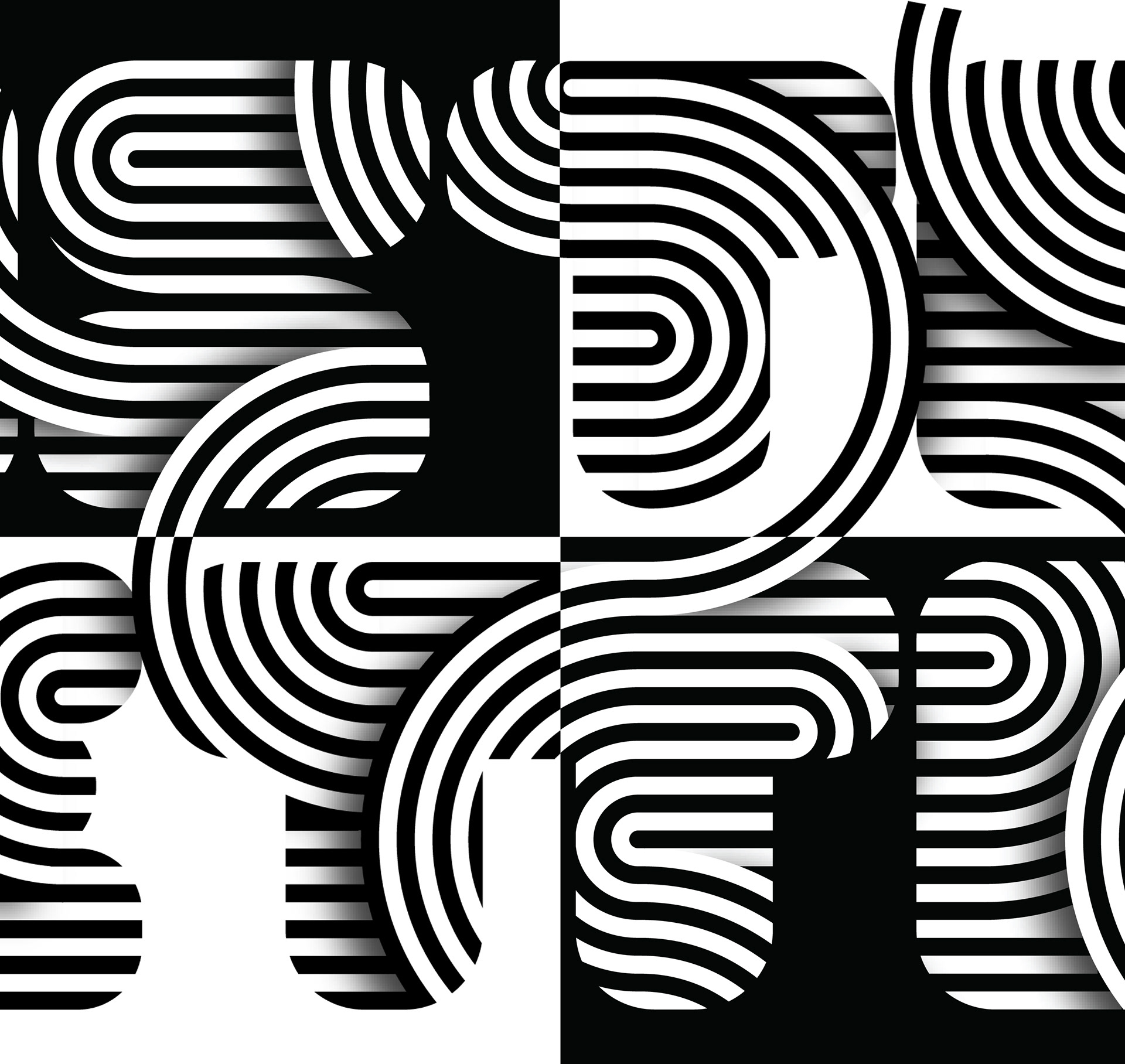
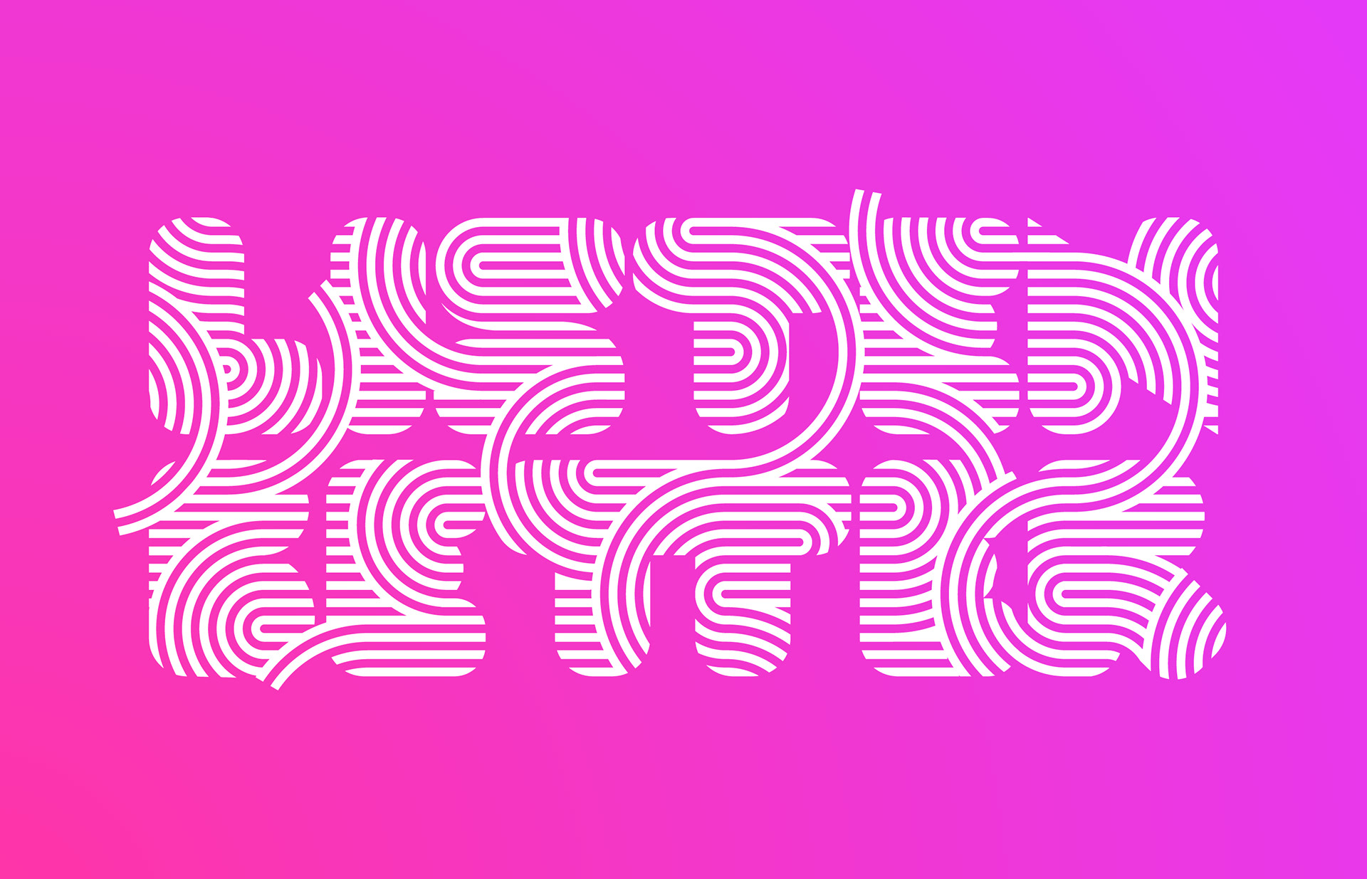
1.
The letters reveal a vibrating texture of connected, vibrating rings. The illustration is filled with juxtapositions: it is still and moving, represents sound visually, and blends two and three dimensions. There are versions for positive and negative, with a flat version for silk screen or embossing.
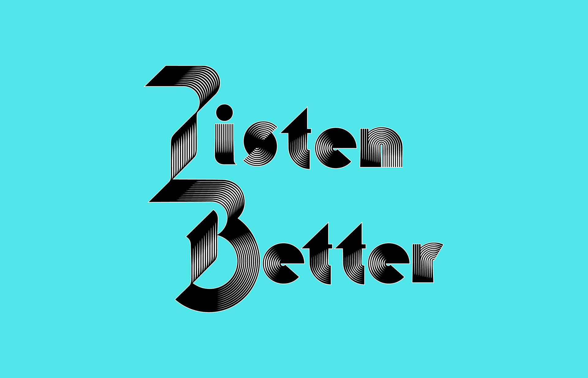
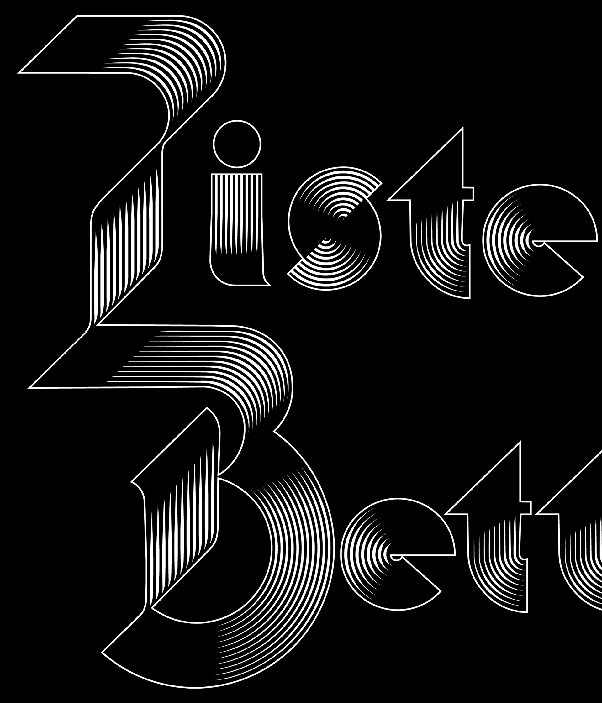
2.
The badass version, this concept takes inspiration from gothic and heavy metal typography. The sharp, repetitive linework feels like vinyl grooves or pulsing sound, and the lockup tiles nicely as a fluid pattern.
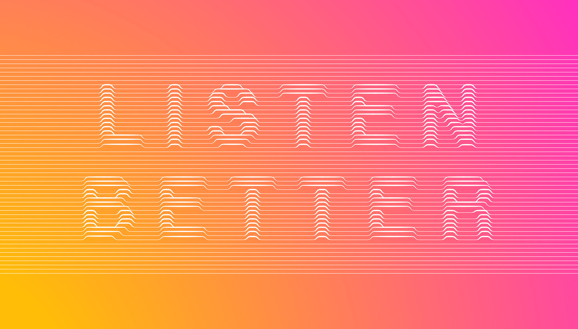
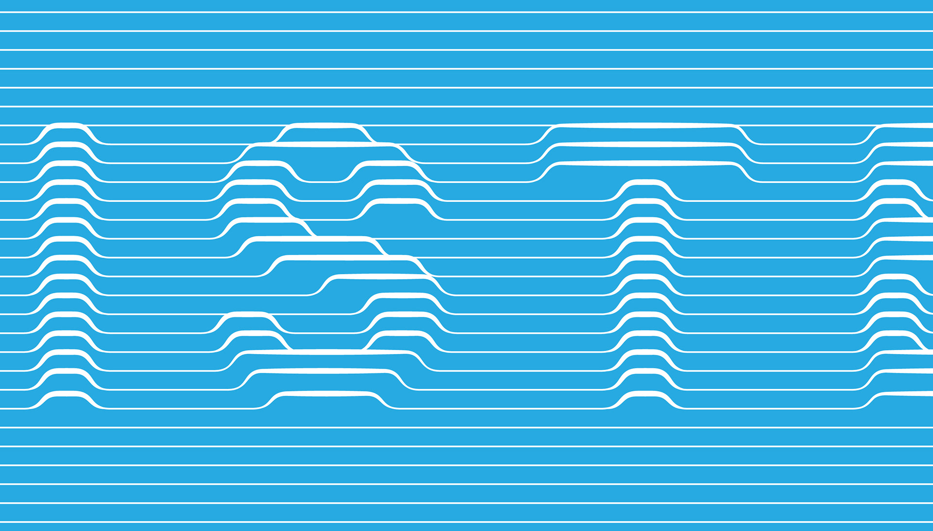
3.
This concept represents sound by referencing electronic measurements of sound, like seismographic readouts. The letters rise up from an infinite band of thin lines for unusual application opportunities.
Thoughts? Shoot a note.
Thank you!